
9:16
Stories and ReelsFull-screen vertical at 1080 by 1920. The top and bottom bands sit under interface chrome, so the product belongs in the middle of the frame.
Every asset generated from your own product page and composed for the placement it runs in, so a vertical Story and a feed image are designed separately instead of cropped from one file.
Every asset is generated at the ratio the placement expects, so a Story and a feed image are composed for their own surface instead of being cropped from one master file.
Full-screen vertical at 1080 by 1920. The top and bottom bands sit under interface chrome, so the product belongs in the middle of the frame.
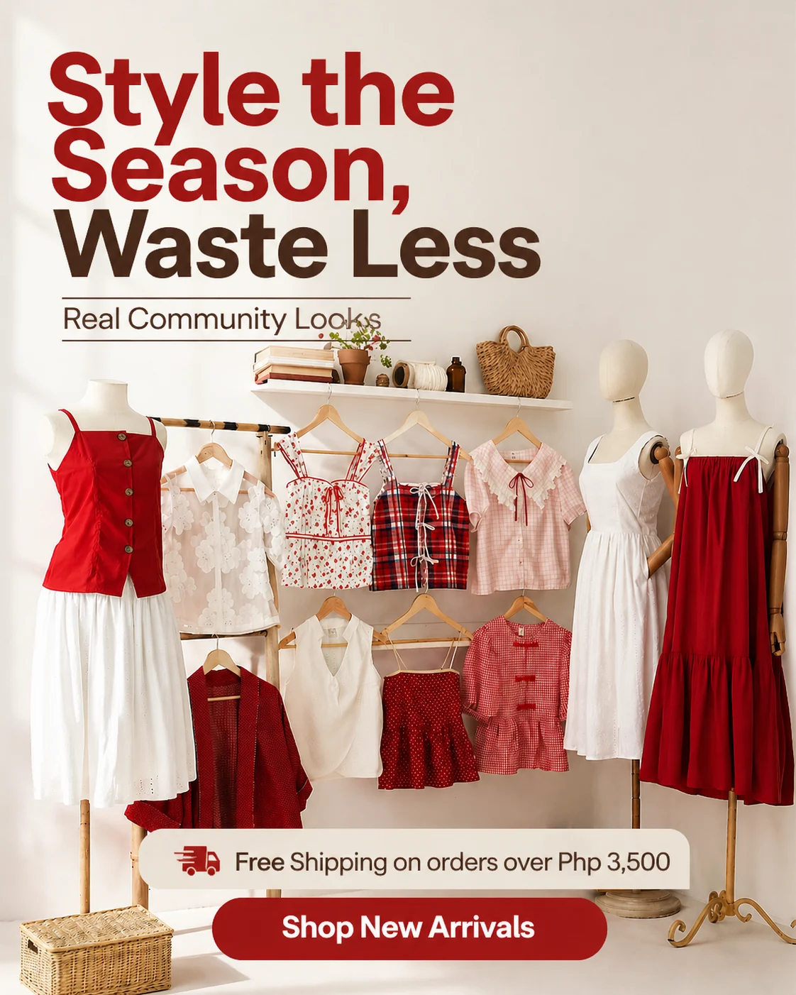
The tallest ratio Instagram renders in the feed without cropping, which is why it earns the most vertical space in a scroll.

The format that keeps a profile grid coherent and remains the dependable workhorse for multi-image units.

Supported for single feed images, though it gives up scroll height and leans on the headline to carry the click.
Each asset below started as a product photo and a URL, composed for a vertical or feed placement with no manual rebuild between them.
Neon Cyberpunk Sneaker Drop
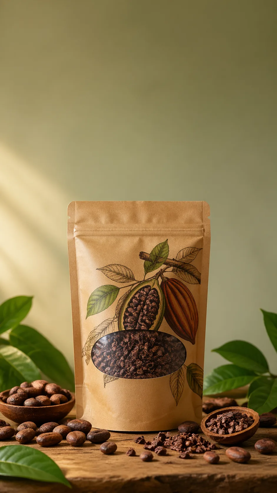
Organic Skincare Product Feature
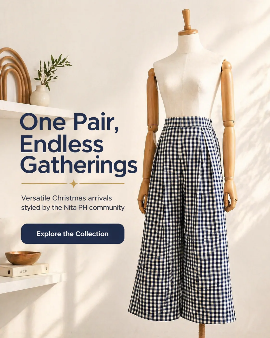
Sustainable Activewear Series
Minimalist Gold Jewelry
Neon Cyberpunk Sneaker Drop
Organic Skincare Product Feature
Sustainable Activewear Series
Minimalist Gold Jewelry
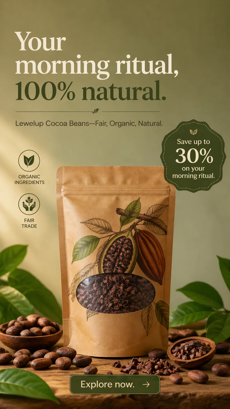
Luxury Watch Editorial

Artisanal Coffee Subscription
Organic Pet Wellness Treats
Portable Adventure Gear
Luxury Watch Editorial
Artisanal Coffee Subscription
Organic Pet Wellness Treats
Portable Adventure Gear
The four things that decide whether a generated creative survives a live placement.
Instagram is two surfaces pretending to be one app. In the feed, a static image sits inside a scroll of other people's images, framed by a profile header above and a caption below. In Stories and Reels, a full-screen vertical creative competes with a thumb already hovering near the skip control. An asset that works in one of those places usually looks wrong in the other, and cropping a single master file into three frames is the fastest way to make an account look cheap. Adssmith is an AI ad creative generator built for the opposite approach: it reads your product page, extracts your brand rules, and composes each creative for the placement it will actually run in, without redrawing the product.
Feed is a comparison context. Your image appears between other images while the viewer is scrolling, so it has to say what it is within the first fraction of a second and still reward a second look. A headline, a detail worth noticing, and clean edges all earn their place.
Stories and Reels are a takeover context. One creative fills the entire screen, nothing competes beside it, and the viewer's hand is resting on the way out. That changes the composition rather than the styling: fewer elements, a larger subject, and a single idea that survives a glance.
Stories and Reels are 9:16 and full-bleed at 1080 by 1920. Because interface chrome sits over the frame, Meta's published guidance for vertical placements reserves roughly the top 14% and the bottom 20% of the screen for elements you do not control. The middle band is the only region you can count on, which is where the product and the one line that matters belong.
Feed images run up to 4:5, the tallest ratio Instagram renders in the feed without cropping, which is why it claims the most vertical space in a scroll. Square 1:1 keeps a profile grid coherent and remains the dependable format for carousel units. Landscape 1.91:1 is supported for single feed images, though it gives up scroll height and usually asks the headline to carry the click.
These are not the same picture in different frames. A 9:16 layout with the product in the lower third is a deliberate vertical design; the 4:5 version is a different composition, not a crop of it.
The most common Instagram failure is not ugliness, it is mismatch. A creative that looks like a stock photo dropped into an account with its own visual voice reads as an advertisement before anyone reads the label. Native means the palette, type, and layout rhythm match the brand a viewer just saw on your site, while the composition matches the surface. Those two requirements pull in different directions, which is exactly where prompt-only generation struggles: the model optimizes for what looks good rather than for what stays yours.
Paste a product page. Adssmith reads the imagery, the selling points, and the price framing the way a customer would, then extracts the brand layer, palette, typography and layout rhythm, and holds it as a hard constraint on generation instead of leaving it to a prompt.
Generation is image-to-image against your own photography, so the product is relit and recomposed rather than redrawn. Your original pixels anchor geometry: the label stays legible, the silhouette stays correct, the material does not drift into something adjacent. Each ratio is then composed for its placement, which is why the Stories asset and the feed asset are siblings rather than the same file twice.
Because the real constraint on an Instagram account is production time rather than ideas, Adssmith returns sets instead of a single hero asset. Several angles per product, all inside the same brand rules, so you can put distinct creative ideas in front of an audience instead of arguing about one.
First, does the product match the photograph exactly? If the lettering on the label changed, the asset will generate returns rather than sales.
Second, is everything that matters inside the safe band? On a full-screen vertical, text near the top edge is fighting the account name and progress bar, and text near the bottom is fighting the caption and call-to-action.
Third, does the set look like one brand? A profile grid rewards coherence, and a single off-brand asset makes every neighbouring asset look accidental.
Adssmith is deliberately narrow: product in, on-brand Instagram creatives out. It is not a scheduler, not an analytics suite, and not a general design canvas. Keep your design tool for the one-off hero asset and your prompt-based image model for abstract art, and use this for the production volume that neither of them makes cheap.
If you do not sell physical products, the same pipeline runs from your brand information and uploaded materials, so service businesses are not locked out of the workflow.
Start with one product you know well. Generate a Stories set and a feed set separately, then look at two things: whether the product survived unchanged, and whether the vertical composition is doing something the feed composition is not. If both hold, the limiting factor becomes deciding which angles to test, which is a much better problem than rebuilding layouts for every placement. If the same product runs on both surfaces, the Meta ads creator page covers the feed-side workflow, and the ad creative examples gallery covers the layouts themselves.
The things advertisers ask before a generated asset goes into a live Instagram placement.
Paste a product URL and see whether the brand comes through before you spend anything.