



Most people searching for ad creative examples are not looking for inspiration in the abstract. They are trying to answer a specific question about their own account: what should this asset look like? A folder of pretty images does not answer that, because a picture you cannot read teaches you nothing about why it works.
So this gallery is labelled by pattern rather than by product. Each example is here for one structural decision you can lift: where the hook sits, how the offer is framed, and what carries the proof. The product changes; the structure travels.
What makes an ad creative example worth studying
A useful ad creative example survives three questions.
First, can you tell in one second what is being sold? If you have to hunt for the product, the creative is a poster, not an ad.
Second, can you tell in three seconds who it is for and what it promises? That is the hook, and if it lives in a paragraph of small grey type, it does not exist.
Third, if the copy were removed, would the image still communicate the benefit? Ad platforms increasingly show assets in stripped-down placements, and a creative that depends entirely on overlay text collapses there.
Examples that pass all three are worth copying structurally. Examples that only look good fail the moment they land in a placement that crops them differently than you imagined.
The patterns worth stealing
Each tile above is labelled with the move it makes. Seven of those moves recur through the twelve, and those are the ones worth briefing.
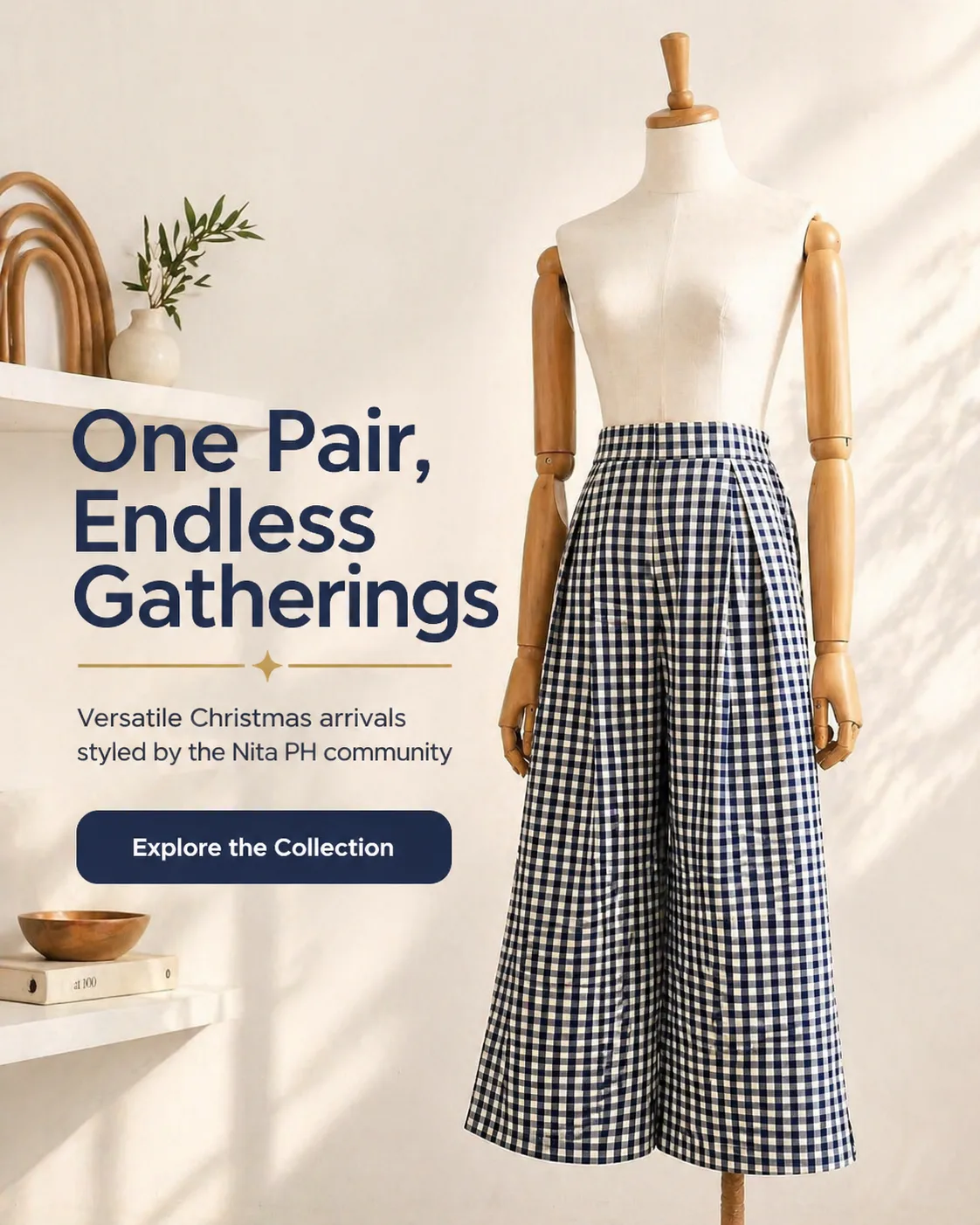
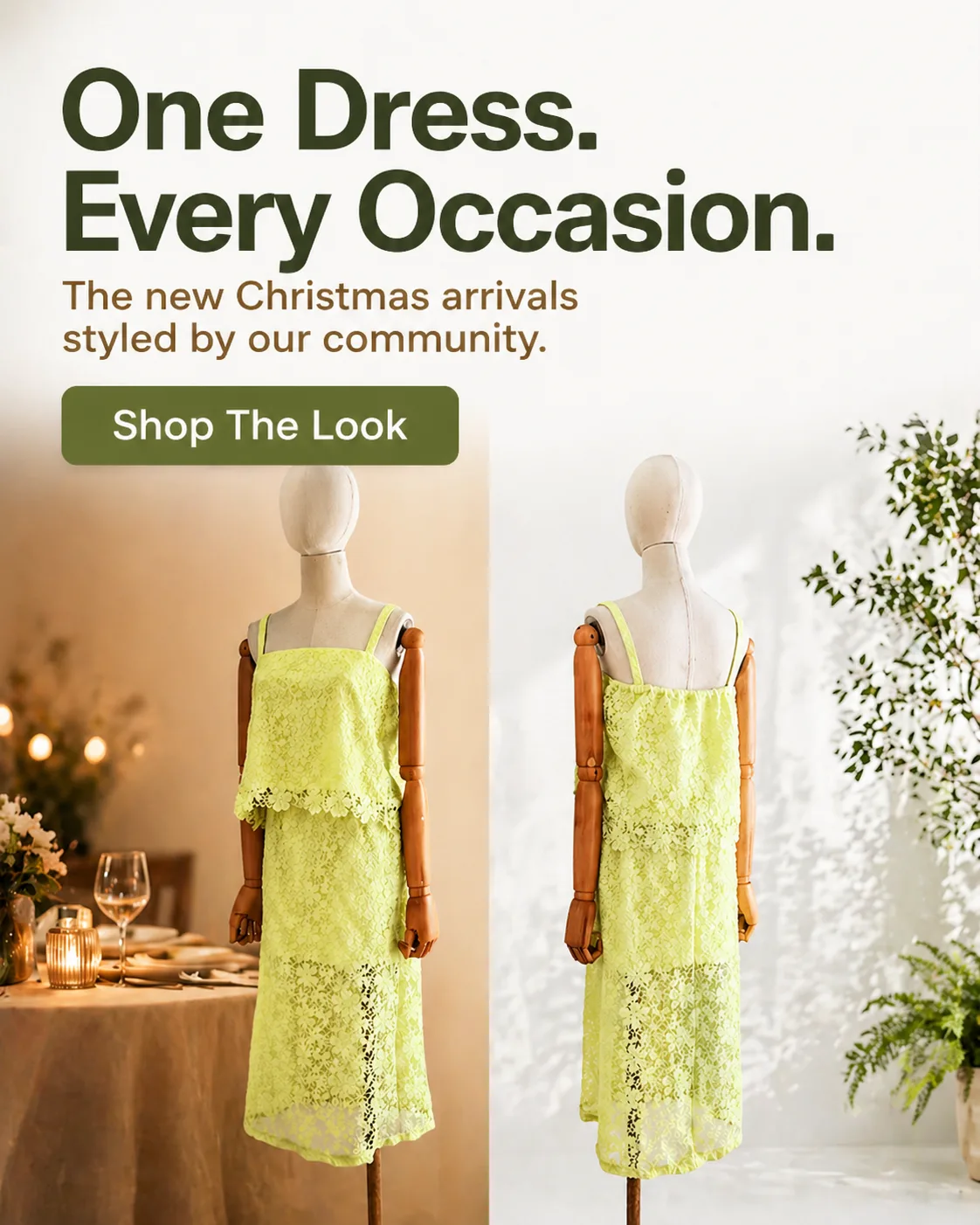
Statement headline in its own column. The claim, a supporting line and a button sit in a text column, with the product photographed in a styled scene beside it. The column takes width the product could have used, which is why the product is placed off-centre and shot straight-on. It is the most common structure in this gallery, and the one that survives a fast scroll.
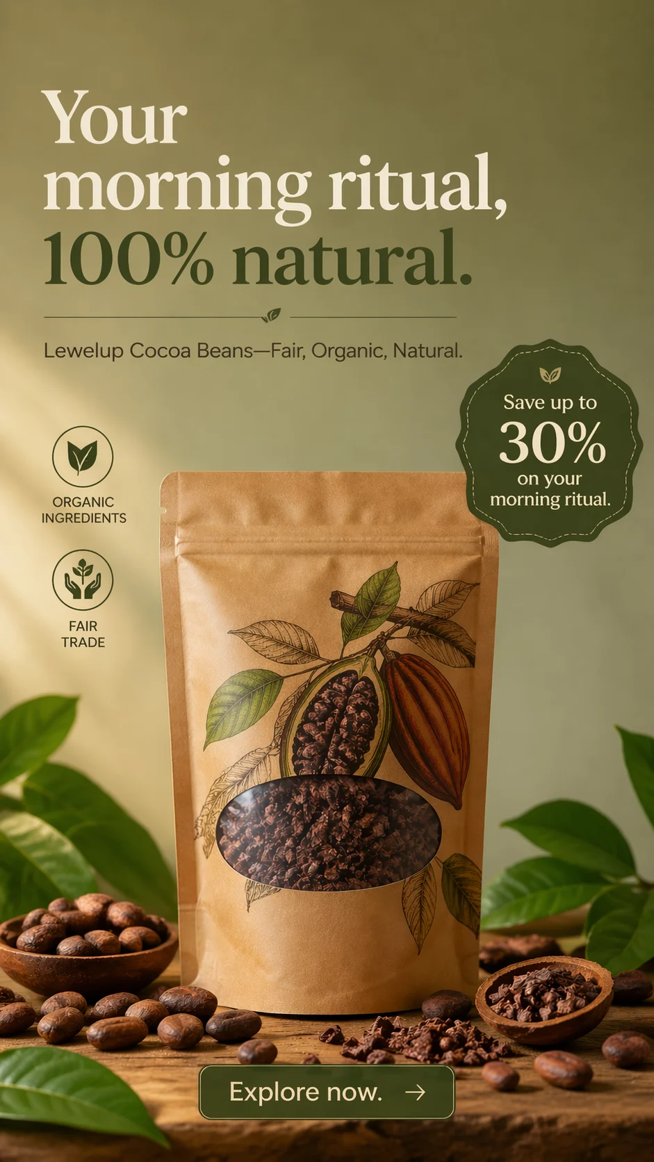
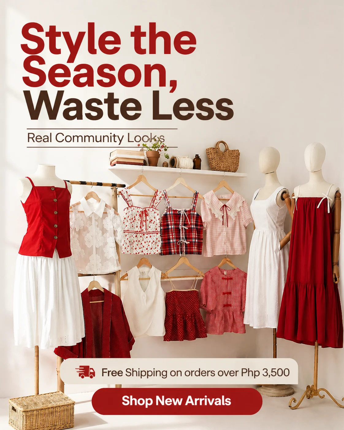
Offer as a badge or a bar. The discount or the shipping promise sits inside the frame as an element — a starburst seal, a strip under the product, a line above the button — rather than as the headline itself. It works when the offer is genuinely the differentiator. A badge for a discount everyone runs reads as noise, and a shipping threshold only means something to a shopper who was already close to it.
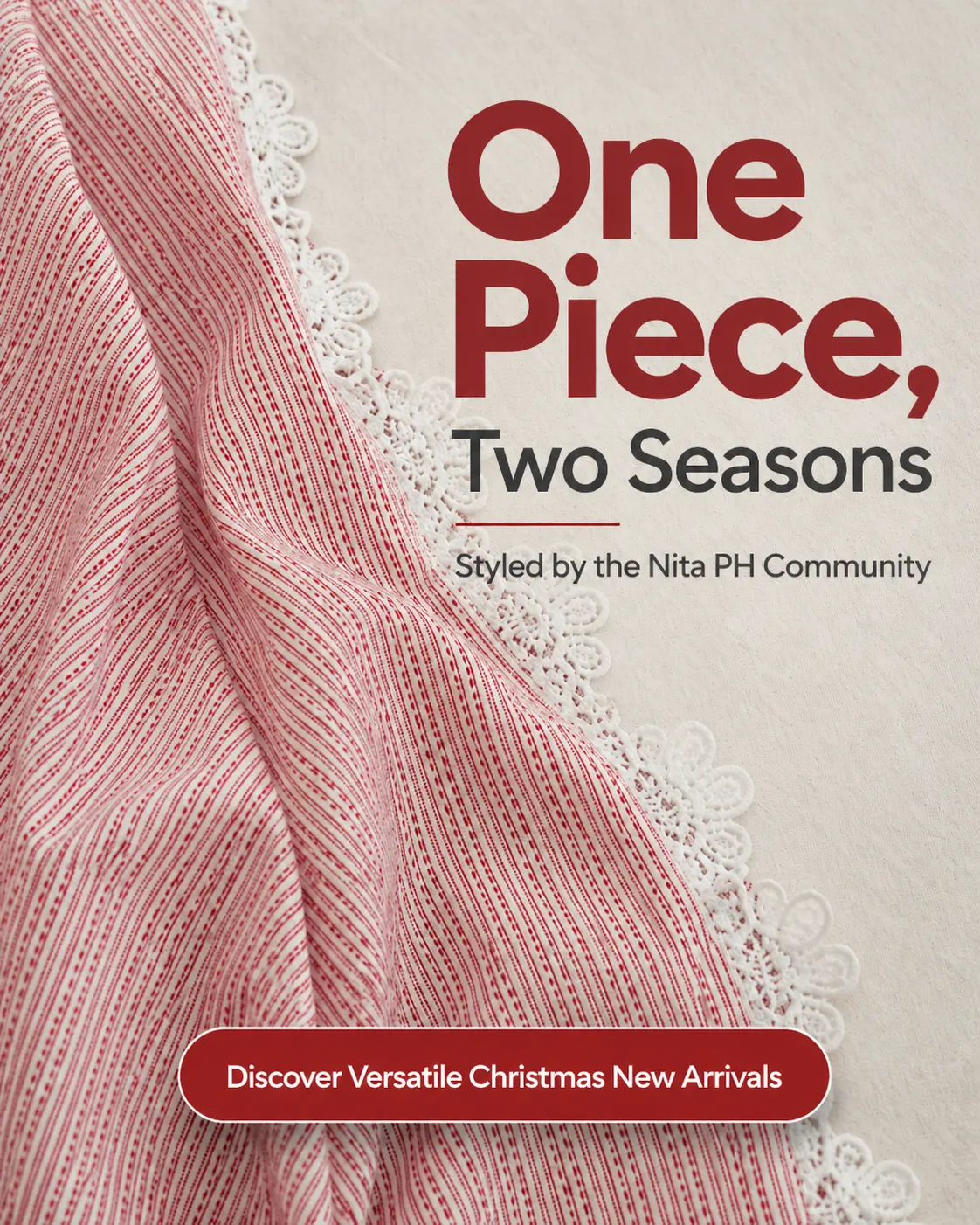
Community proof in the headline. Building the ad around photographs your customers already took turns a product shot into evidence that people wear the thing. It is the proof that costs least to produce and the easiest to fake, which is why the tiles above name a real community instead of an invented customer count.
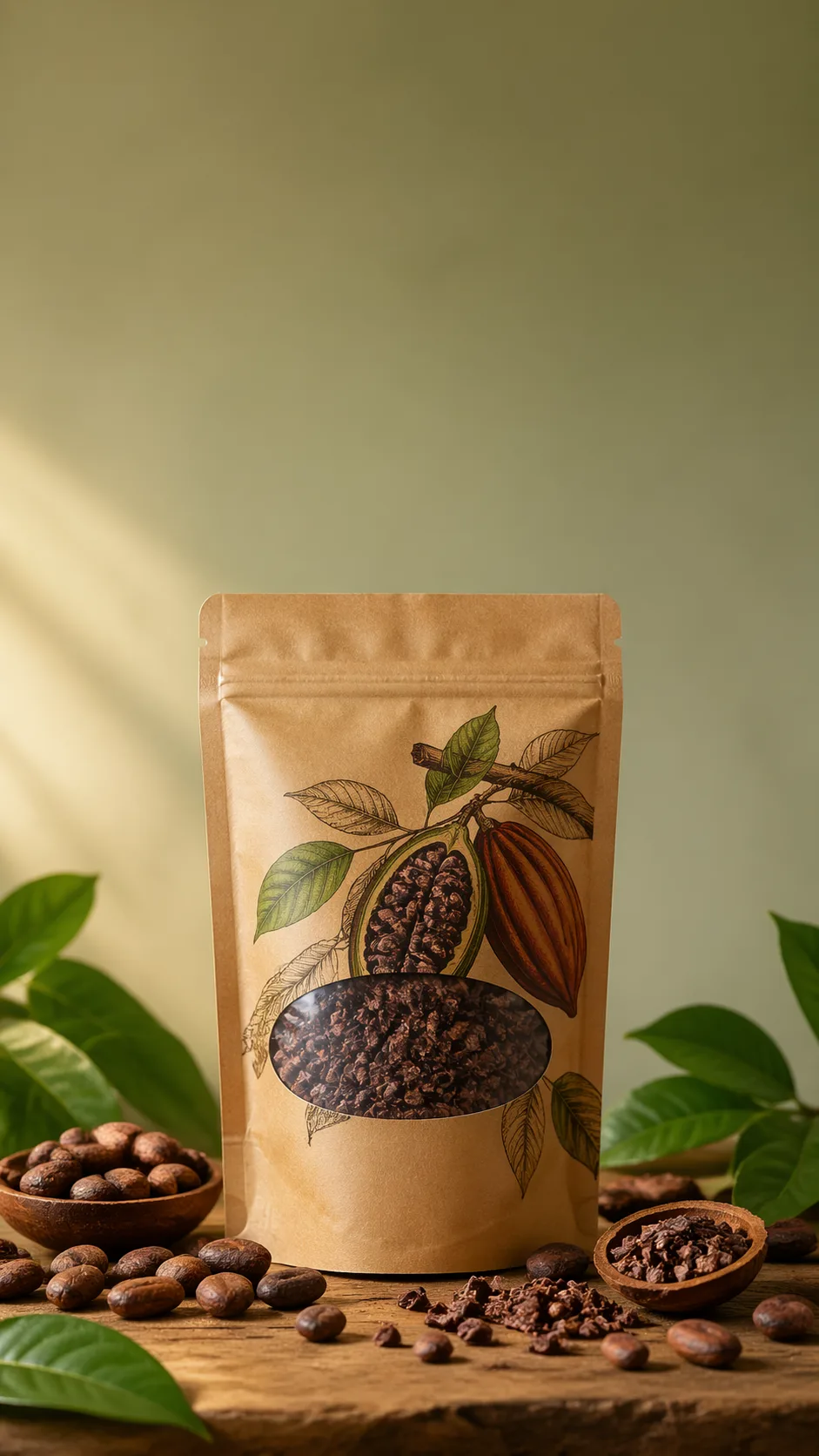
No copy at all. One of the twelve is a plain product photograph with no headline, no button and no offer. A text-free asset is the one that still works in placements that strip overlays, and the only one that never competes with the platform's own interface.
Front and back in one frame. Two panels of the same item from opposite angles answer the question a single photo cannot: what it looks like when it moves. It costs no extra copy.
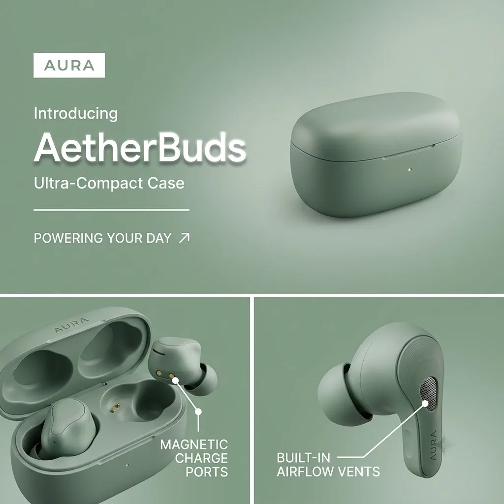
Labelled detail panels. Close-ups with a line pointing at the part being claimed. It answers what makes the product different without a paragraph, and it ages better than copy does, because the product itself is the argument.
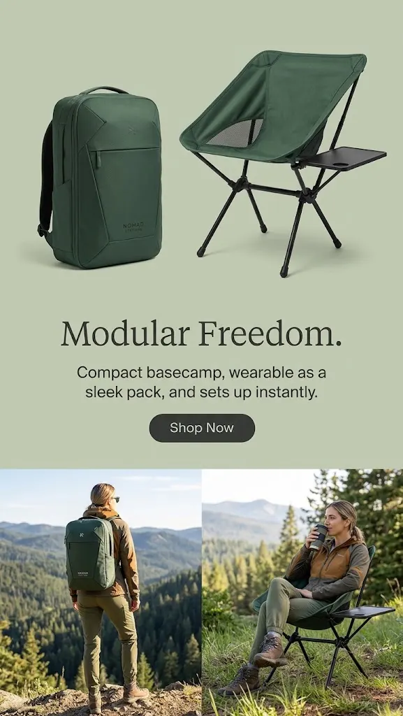
Flat background, product lineup. A single-colour field, the products shot on it, one benefit line and a button. It is the easiest pattern to produce at volume, because it barely depends on photography, and the safest one to crop.
Reading information hierarchy in a single glance
When one of these creatives works, three questions get answered in a fixed order, and the order is the craft:
- What is it? — the product, recognizable and undistorted.
- What does it do for me? — one claim, not four.
- Why should I believe it? — proof, an offer, or a demonstration.
Most weak creatives fail at step two by trying to answer everything. A benefit list of six features reads as zero features, because nothing has priority. If you remove the copy from a crowded asset, you usually find that the visual hierarchy was never there to begin with; removing text just reveals it.
That is also why the number of text elements matters more than the amount of text. Three elements in a clear order beats one dense block every time.
How to study an example without copying it
Copying an ad creative example produces a worse version of someone else's asset, aimed at someone else's audience, with someone else's photography. The useful move is to extract the structure and drop your own raw material into it.
Take the statement-headline pattern. The transferable part is not the wording, it is the decision that the claim gets its own column instead of being spread across the frame. Apply that decision to your own product photo and the asset becomes yours while keeping the structure that earns attention.
This is what an AI ad creative generator makes practical. Instead of briefing a designer to redraw each layout, you describe the structure, and generation produces the layout using your product and your brand rules. The structure is borrowed; the product, the palette, and the typography stay yours.
When you review a gallery like this one, write down the structural move you want, not the aesthetics you like. Aesthetic preferences are hard to brief and harder to reproduce. Structural decisions are easy to brief, easy to test, and easy to iterate on.
Reading a gallery by placement, not by taste
For placement-specific guidance, compare the Meta ad formats with the Instagram feed and Stories layouts. To build a still-image variation from your own product photo, use the static ad generator.
The same creative does not work in every surface, and a gallery that ignores placement teaches the wrong lesson.
Feed placements reward a strong top-third hook and a product that is legible at thumbnail size. Story and Reel placements reward a single subject with clean margins, because interface elements will cover the top and bottom of the frame. Square placements reward balance, since there is no natural direction for the eye to travel. Landscape placements reward short overlays, because the copy is competing with the surrounding article rather than filling the screen.
When you look at an example, ask which placement it was composed for. Half the reason a creative looks wrong in your account is not that the design was bad, it is that the composition was made for a different surface and then cropped into yours.
What not to take from these examples
Three things in the gallery above are deliberately not transferable.
The products. They are placeholders chosen to illustrate structure, not category recommendations. A layout that works for a bottle can work for a software product; the pattern is the transferable part.
The exact copy. Headline length and tone depend on your audience's vocabulary, not on what looks balanced in a mockup.
The color treatment. Every example here leans on a specific palette to create contrast between the product and its background. Your brand palette already has that job. Replacing it with a borrowed one buys a short-term style match and costs you recognition.
A practical way to use this page
Pick three examples that stop your eye, then write down for each one the single structural move you noticed: where the hook sat, what the first thing in the hierarchy was, and what carried the proof. You will end up with three briefs, and three briefs are worth more than a hundred bookmarks.
Then generate the variants, run them, and let the account tell you which structure fits your audience. The examples give you the shape of the test. The results give you the answer.